In the book, the people are the story. There is little discription of the estate. I'm sure I'm not the only American with a somewhat lacking understanding of British estates or council estates as I'm learning to call them. That might even be where we borrowed the idea of HOAs - Home Owner's Associations that govern the basic conduct of the area (housing development).
So back to art... this is balanced. If I could, I'd remove the larger tree on the left because I'm thinking less about art and more about getting the copy on the back cover to pop out to the shopper. On this one, I'd probably transluse the spine and back cover background. Lots of nice space on the front for the title, but not sure about where the author name goes.
There is a bit of unwritten rule about author names. If you look at the big name writers, their name is almost always larger or as large as the tile. With lesser known writers, the pitch is to have a catchy title and use it to sell the book more than the author's branding.
I like the people placement on this one because the story is the doctor (the guy in the middle). Gotta have doc's feet in the scene though. That drives me nuts to have him standing on his lower legs.

This one takes Glyn's background photo and fixes many of the elements that drove everyone crazy with my concept drafts. The focus in the title and the photo needs to be on the doctor. He is very much the main character. Nice artistic touch to reverse the light/dark on the spine from the light/dark in the background. I don't think I would have thought of doing that. That makes the spine text tricky and it certainly needs to have the author name on the spine and a copule other fixes. Ignore the fence post, we aren't going to leave that, but drafts are concept pieces, the details get worked out later.
 This one takes the background and moves it to a residential setting. Either works for the storyline. I rather not have a pink tint, but that is easily fixed. Mostly the same issues exist in this one as the others, but as I said, this is a concept stage of development.
 No way is this book that fat, but nice pitch for the concept.
 The main point of posting this exercise is to make writers aware that while it is easy to upload to one of many online DIY sites, just plopping a cover on a template isn't all that great of an idea.
 Anyone who wants to play with concepts for this cover, be my guest. Send them to me in an email, preferably as a pdf file.

 When Paul Fenton stops for breakfast in a small town, he gets more than he bargained for in the process.
 When two-hundred-year-old human remains are discovered on one of Neptune's moons, Earth's history falls into question.
 Emily's husband persuades her to try thalidomide to ease her symptoms as she is unaware of the devastating effects.
 Who is the women's shelter bomber? Melissa Ryan suspects that her husband knows.
 Further developments with the Wilder family.
 A hidden past shakes the O'Donovan family to its core
 A swirl of emotion and choice, set in Cape Town, South Africa
 Love is a constant, but it comes at a price.
 When the road ahead is unclear, sometimes you have to rely on trust.
 The struggle between good and evil is ages old. It gets all the more complicated when the good guys aren't all good and the bad guys have redeeming qualities.
 Story of a land mothering two races of people – the light-skinned and the dark-skinned.
 A gifted Ukrainian ballerina comes into possession of a mysteriously coded address book.
 Six passengers' lives change for better or worse after they arrive in Honiton.
 Resilience and love in a harsh and unforgiving age
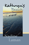
 Kathryn's Beach
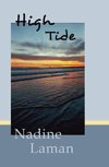
 High Tide
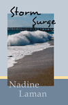
 Storm Surge
I like the idea of the houses as a background. The pic is more fitting with the back page blurb. The doc is lost in the brickwork though. So maybe needs to fade slightly. No pink as you say. I like the ice blue tint of the winter scene. Can the two images be layered?
ReplyDeleteThe title and author name look good and in the right places.
Well that is my 2 cents. Keep up the good work!
I agree. I think pink is reserved for YA and Chick Lit covers. It certainly shows that there are some talented graphic artist in our midst.
ReplyDeleteI don't know anything about making covers but I do know what I like the look of and I've got the feeling that this cover is going to be very good!
ReplyDeleteHello DJ, thanks for the kind comments. I'll post our final product.
ReplyDeleteThe doctor does get sort of lost...
ReplyDeleteIt's incredible how much work goes into making covers for the books. It really is an art.
Wow!
Joey, welcome. Yes, it does take a lot of effort. Did you watch the video at the bottom of the first post in this book cover series? She had a bit to go on as the other books in the set were done.
ReplyDeleteI spend months thinking about cover art for a book. I'm thinking about the concept for one coming out next year while working on Glyn's and Nidhi's books.
The concept is one thing, finding the right graphic artist to bring it to life is another thing.
Any suggestions on the samples?