 I like to look for fonts for book covers. It is half finding what is imagined and half imagining the look of the fonts found. Be sure to buy the licence, if you're using someone else's font. You wouldn't take kindly to them using your book without buying it, right?
To the right is a book cover that was proposed. The book was/is set in India and the author is Indian. When I saw the font, I knew it was the one to use. I did the ink drawing of the tree. I don't know if it will show very well in this picture.
In the end the book was published by another publisher, so this cover isn't on the copy of the book you can buy on Amazon.

The book cover above is for a story set in England and the author is English. It is the best selling book for Cactus Rain Publishing.
Very clearly, the font for the title is not Old English. It doesn't look like lace. However, I liked the look of the way the letters were drawn in contrast to the ink/line drawing. Notice the linen paper look beneath the yellow wash? Rich.
It is a beautiful pen and ink drawing. There are sites where art and the license to use it can be purchased.
As I look at these covers I notice that unwittingly, I've developed a signature for my cover designs. Made me smile at the realization of it. Can you see it?

This cover above is the latest addition to Cactus Rain Publishing.
It is set in Kiev by a Ukrainian author. The book debutes on June 1, 2014.
For this cover, I wanted a font/typeface that gave the impression that it was Russian. None of the fonts that I tested gave the look I wanted for the cover. (Most of the font sites I use allow a space to type in the text and see how it will look.)
The drawing was done by the author's friend, artist Laura Mitchell.
Come to www.CactusRainPublishing.com and check out these books!

 When Paul Fenton stops for breakfast in a small town, he gets more than he bargained for in the process.
 When two-hundred-year-old human remains are discovered on one of Neptune's moons, Earth's history falls into question.
 Emily's husband persuades her to try thalidomide to ease her symptoms as she is unaware of the devastating effects.
 Who is the women's shelter bomber? Melissa Ryan suspects that her husband knows.
 Further developments with the Wilder family.
 A hidden past shakes the O'Donovan family to its core
 A swirl of emotion and choice, set in Cape Town, South Africa
 Love is a constant, but it comes at a price.
 When the road ahead is unclear, sometimes you have to rely on trust.
 The struggle between good and evil is ages old. It gets all the more complicated when the good guys aren't all good and the bad guys have redeeming qualities.
 Story of a land mothering two races of people – the light-skinned and the dark-skinned.
 A gifted Ukrainian ballerina comes into possession of a mysteriously coded address book.
 Six passengers' lives change for better or worse after they arrive in Honiton.
 Resilience and love in a harsh and unforgiving age
 Kathryn's Beach
 High Tide
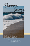 Storm Surge

No comments:
Post a Comment